
|
Calendar of Events
January
February
March
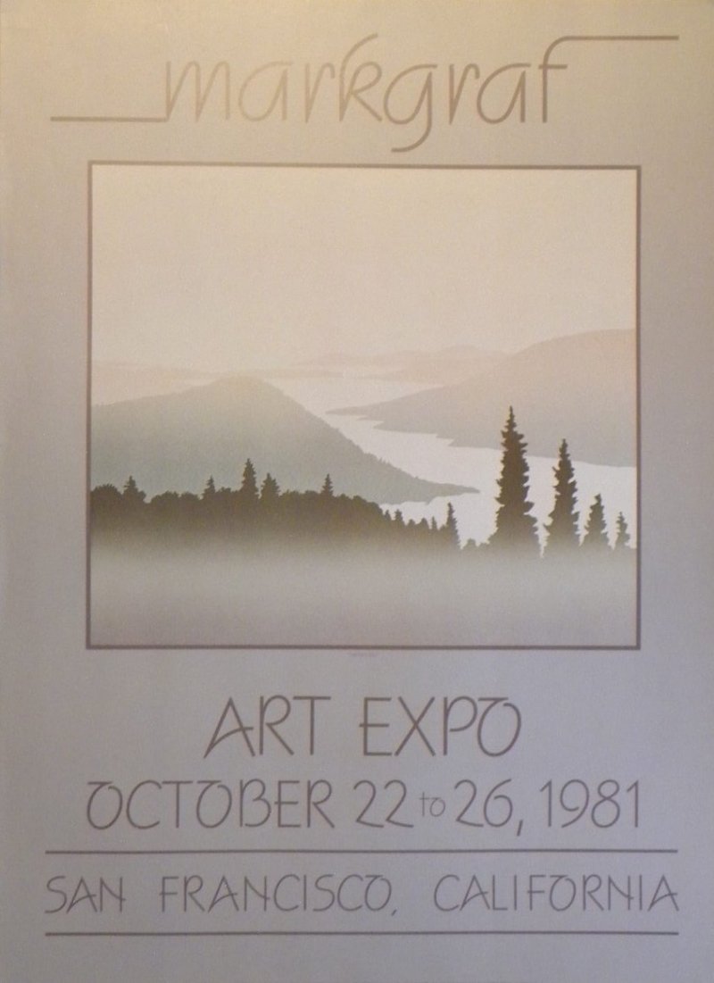
Featured Artist:
Peter &Traudl Markgraf
Spitfire Dance:
Producing a New Musical
Hudson Film Society:
Video Contest
Artists Peter & Traudl Markgraf, page 2
They sold their house in Hudson, bought a truck and a big trailer, packed everything up and spent the summer of 1977 driving across the country, taking in the scenery and planning a series of editions on Canada. When they got to BC, they drove up the Coast and bought a house on the side of a mountain looking west over the fishing village of Pender Harbour on the Sunshine Coast. In their new studio overlooking the sea and Texada Island they started printing their Canada series of lanscapes.
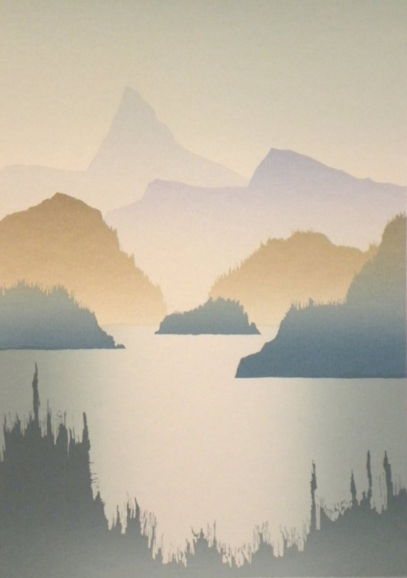
As can be seen from “Prairie Sky,” the picture at the bottom left on the opposite page, their landscapes were still faily abstract. They printed ten editions of scenes from across Canada, inspired by their trip. They found a publisher in Vancouver, Canadian Native Prints, and they had their first opening.
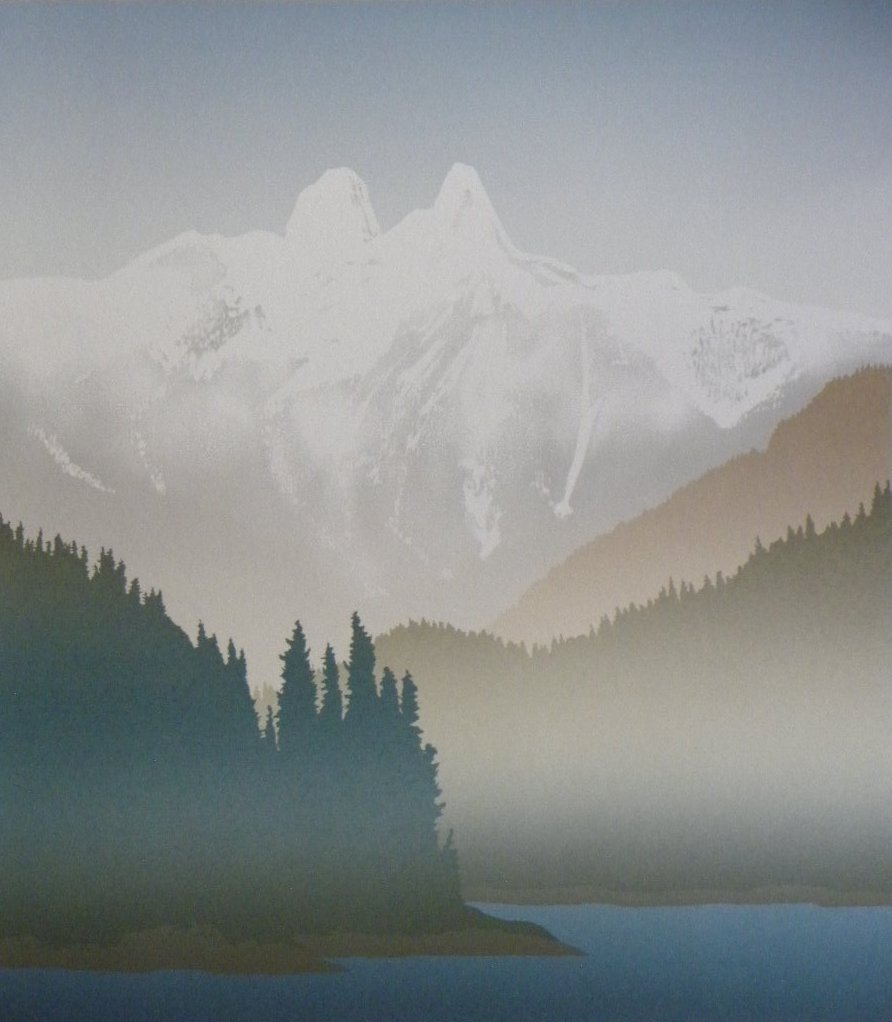
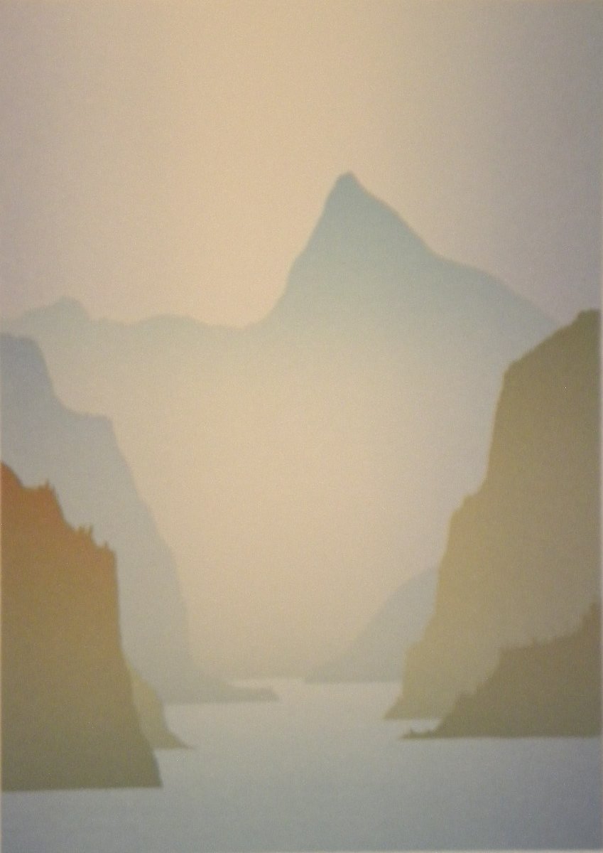
Almost every available print sold within days. With time, their work softened, as can be seen in “Prairie Dawn,” next to “Prairie Sky.” They started concentrating on BC scenes, had many more openingts in Vancouver and exhibitions in San Francisco and New York. Often all prints sold out during the opening, with people queuing around the block. They found that the more realistic works were the most popular and printed recognizable BC landscapes with their shading techniques ideal for recreating the fog and mists of the BC coast.
After ten years of working hard Traudl developed health issues and the couple was ready for a change. They moved to the Cayman Islands and produced a few more editions from a studio there. The new works, showing scenes from the Caribbean and Hawaii, were never as popular as their BC works. At the end of the 1990s, they returned to Hudson for a retirement with family and friends who still lived here.
Below is a popular print called “Sunset.”
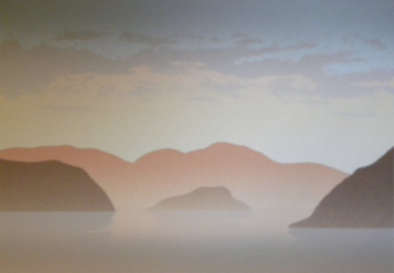
Today smooth shading is not techncially difficult. You can program a computer to go from light grey to blue in 100 steps and it will be completely even and look smooth. Your inkjet or laser printer will print the corresponding shades. But in the 1970s and 1980s it was difficult to achieve, even with high quality offset printing.
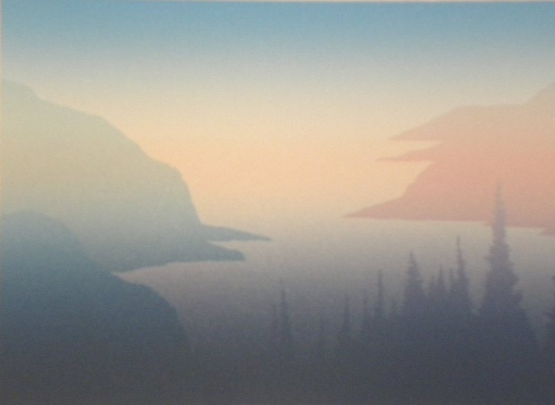
“Ruby Lake” above and “Cove” below highlight Peter and Traudl’s shading technique. These two prints were among the most popular and feature complex shading. “Ruby Lake” has shading going from the top down and from side to side while “Cove” has shading in three colours, from blue to pink to grey.
Peter and Traudl started experimenting with shading by putting two colours side-by-side on the screen, but they found this method resulted in lines rather than smooth shades from one colour to the other. Their breakthrough came when they separated the two colours with a transparent acrylic base. Each colour bled into the transparent section, giving a smooth transition.
Peter and Traudl used this technique to create the serigraphy editions, meaning that the prints are not copies of an original but represent 100 or so originals. They ran about 200 sheets of paper through the process initially, first with one colour or shading and then with a second and third layer. They usually printed the overall shading first and added the solid shapes at the end.
After a print run, they verified each sheet of paper and discarded the ones where the result was not perfect. When the last colour was printed, they would take out the first finished print, about 10 during the run and the last print. They would check these proofs and each print for consistency and accuracy. Again, imperfect prints were discarded.
This process results in the uneven numbers of the print run. A print might be numbered 24/139. This means it was the 24th print out of a run that yielded 139 acceptable prints.
The Silkscreen Process
In traditional silk screen printing, a board with a rubber edge called a squeegee is used to squeeze paint through a nylon screen onto a sheet of paper. The screen is mounted in a frame. The printer glues shapes onto the bottom of the screen, pours the color of paint he wants onto the screen and wipes the paint back and forth with the squeegee. The paint goes through the screen where nothing is glued on the back and produces corresponding shapes on the paper. The printer then prints the number of sheets he wants in this way, washes out the screen, glues new shapes on the bottom and repeats the process with another colour. Small editions of multicoloured cards, posters and prints can be created in this way.
Peter and Traudl adapted the process for higher print volumes and greater flexibility. They mounted the frame with the silk screen on a machine that raised the frame at the touch of a foot pedal. Large sheets of paper could be moved under the raised screen and then moved out to be placed on drying racks.
Instead of gluing shapes onto the back of the screen, they covered the screens with a light-sensitive emulsion and kept them in a darkroom. They took the painting to be reproduced and covered it with a plastic film. They painted light-proof paint on the film over areas of the painting that were the same colour. They placed the film on the screen in their darkroom and exposed the screen to light. The emulsion hardened except where the light proof paint on the film kept light from exposing the emulsion. The emulsion on the unexposed areas of the screen was then washed out and paint the same colour as the painting could be printed in the washed out shapes. A typical painting would need several dozen colours to recreate all areas of the painting and one, called “Vera” by Frederick Horsman Varley, needed over 80 clours before Peter and Traudl were satisfied that the reproduction was a good likeness.
The initial colours were usually large areas and were simple shapes with opaque colours to give the print the same basic structure as the painting. Later colours were more transparent and reproduced the shadings of the original work. At the end there were always a few areas that needed extra layers of transparent colour to make the print look like the original.